

Color Mixing Basics: The Few Rules That Actually Matter
4 min read
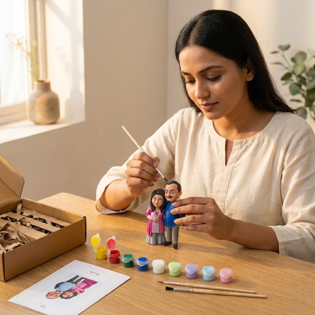
Colour mixing has a reputation it doesn't deserve. People picture an art-school colour wheel, complementary and analogous and split-complementary, and decide the whole thing is beyond them before they've squeezed out a single blob of paint. In practice you need about four colours and three rules, and the rest is just doing it slowly enough to notice what's happening.
A basic 12-tube acrylic set runs around ₹150–300 and looks like good value, but half those tubes will sit unused. What actually gets you through most projects is red, yellow, blue, white, and one dark (a brown or a near-black). Every other colour you'll need for a first project is one of those, mixed. Buying the full set isn't wrong, it just isn't necessary, and a smaller palette forces you to learn mixing instead of reaching for a pre-made tube every time.
This is the one beginners struggle with most, because skin isn't really one colour, it's a warm base with tiny amounts of everything else in it. Start with white plus a small amount of yellow ochre or orange for the base warmth, then add the smallest possible touch of red for a lived-in tone rather than a flat peach. If it starts looking too pink or too orange, a genuinely tiny amount of blue or green (less than you'd think, it's a strong correction) pulls it back toward neutral without turning it grey. Mix a bit more than you think you'll need; matching a dried-out skin tone exactly a second time is close to impossible.
If you're painting one of our figurines
You can skip most of this. Our guides come with the exact recipe worked out already, matched against your actual figurine's colours, so it's parts and pots rather than guesswork. This piece is for anyone mixing paint from scratch, on any project.
One more thing worth knowing before you start: acrylic dries a shade or two darker and less glossy than it looks wet on the palette. If a mix looks slightly pale while you're working, that's usually correct, not a mistake to fix on the spot. Let a small test dot dry fully before deciding a colour is wrong.
Red, yellow, blue, white, and one dark (brown or near-black) covers almost everything for a first project. Most other colours you'll want are combinations of these, not separate tubes.
Usually from mixing three or more colours together at once. Stick to two colours per mix, and use a dark version of the colour itself for shading instead of adding straight black.
Start with white and a small amount of yellow ochre or orange for warmth, add the smallest touch of red, and correct with an even smaller touch of blue or green if it drifts too pink or orange. Mix more than you expect to need, since matching it again later is hard.
Painting & Together-Time
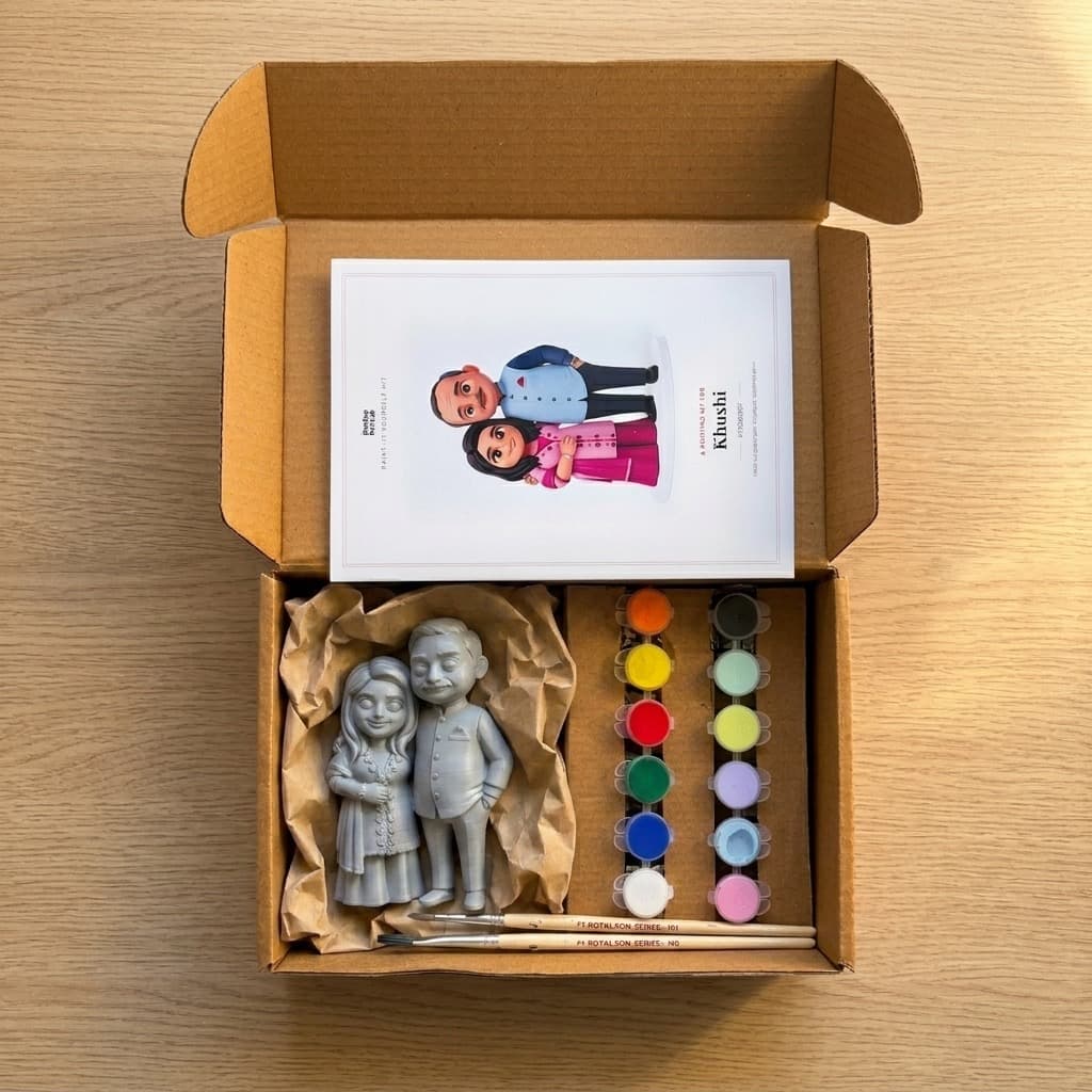
A wrong colour or a smudged line on a half-painted figurine feels final. It almost never is. Here's how to actually rescue it.
4 min read
Painting & Together-Time
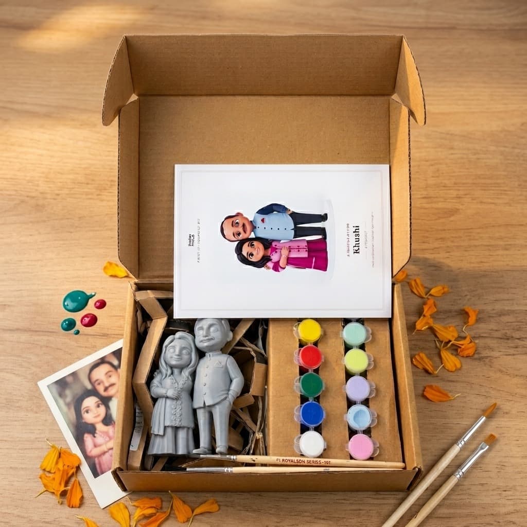
A kit gives you paint and brushes. Here's the short, cheap list of everyday things you'll also want on the table before you start.
4 min read
Painting & Together-Time
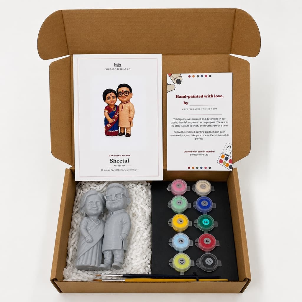
The parts nobody mentions beforehand: how long it really takes, what goes wrong halfway through, and why the crooked bits end up mattering.
4 min read